The problem
Before joining in June of 2022, Ribbon already had three design systems in use, all with varying styles, structure, and underlying code. The very first iteration was from a free Figma Community design system, the second one was no longer maintained by the original creators, and the third one was contracted through an agency. The agency one was the one used the most, but since it was done by an agency and there wasn't anyone focused on design systems, it received little attention.
To solve this, Ribbon hired two Senior Systems Designers. The first was Javier, who joined a month before I did, and the second was of course me. Our sole focus from the summer of 2022 and on was to build a new design system. One that was:
Atomic
Responsive
Documented
Accessible
Prototyped (with accessible components)
Built with tokens in mind
And one that had dedicated resources to maintain
Over only about four months, Quilt grew to contain:
53 component sets
1871 variants
Base documentation on every component
Token support with the Figma Tokens plugin that syncs to a Github repo
My role
As one of two systems designers, we split the Quilt work fairly evenly. Javier tended to take on more of the token and theming while I did more documentation and prototyping while we both split the actual component work.
Setting up the Figma project and component naming structure
Keeping up to date with Figma and making sure components used the latest Figma features
Writing documentation for components
Fixing "bugs" with components (such as improper constraints, instance swapping not preserving overrides, auto layout issues and so on)
Components
Below is a list of components such as buttons, inputs, typography, and colors.
System structure
To keep files small and updates easier, we split Quilt out in to three separate libraries.
Quilt Theme contained all of the colors, typography, shadows, spacing etc.
Quilt Icons contained all of the icons (this was just a duplicate of the Ionic icon library)
Quilt Base Components consumed the Theme & Icon libraries and contained all of the components used by the design team

Accessibility
Accessibility was baked in to the core of the theme file, with respect to color contrast and typography given to the core tokens so that when consumed by the base components, accessibility was a given.
P.S. I'm currently working on an accessibility side project, check it out!
Sample accessibility guidelines
Colors

In Figma, all colors in a palette are shown with their contrast ratio. Every 500 level color has a contrast ratio of at least 4.5:1 with white text (this combo is used in buttons). The only exception is Purple-500 where it fails, but that is the pre-existing brand color and we were unable to change it.
All colors above 500 with white text are at least 4.5:1, and all colors below 500 are at least 4.5:1 when the 000 level color is on top.
Responsive design & sizing
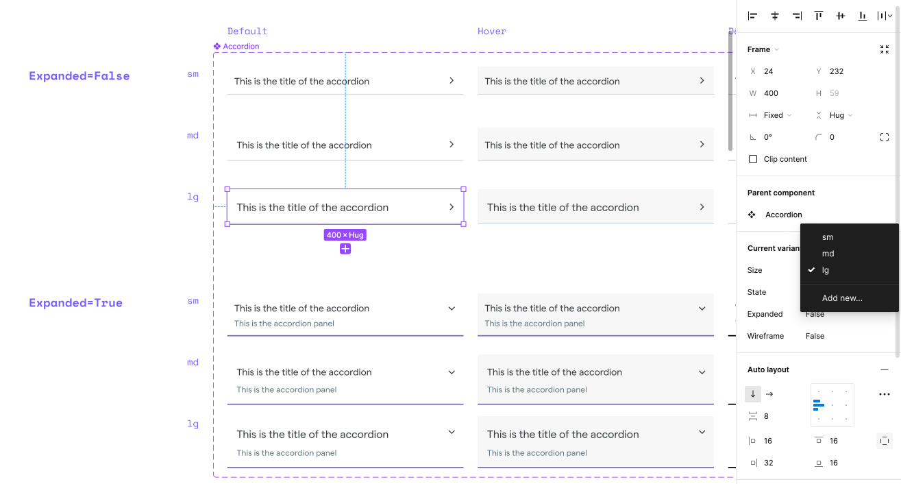
Nearly every component in Quilt contains variants for different breakpoints (sm, md, lg, and the occasional xl or xs). This allowed designers to quickly make responsive versions of their designs by updating the variant sizing property to the appropriate size. For example, an Accordion component has sm, md, and lg variants with different sizes for each breakpoint.
Additionally, each type style also had different sizes that corresponded to what should be used in a component. Body for example has a sm, md, and lg size in the Themes file and when the Accordion component is at the md size, it would use the md Body text style. This made it much easier to make system wide changes to typography in one click, but we also received great buy-in from developers on this being an easy approach to doing responsive development.
Typography
All typography was designed at the core to be responsive across different breakpoints.

Buttons
Buttons in Quilt are perhaps the one component that utilizes the most of Figma's design system functionality. Every button is: responsive, has variants, is interactive, and uses the new component prop functionality.

An example of a button using Variants and Component Properties within Figma:

Built in Wireframing
Originally, we had a separate wireframing library (sourced from a Figma community file) that designers were using to make rapid wireframes of their designs.
However, after a few months and with Quilt getting more and more mature, designers began requesting an easier way to update their wireframe designs to use the final published components. And since the community file and our components were setup differently, it wasn't as easy as just swapping between components and everything working.
To make the designers lives easier, I set out to add a Wireframe variant to every component and every instance in our library. While not as "wireframe-y" as a traditional wireframe kit, there was no mistaking the designs for being in a wireframe state. I stripped out all of the colors to pure black or a mid gray, and changed the font to Chalkboard to make it clearer that it was in a wireframe state.
After just a week, I was able to launch this update and designers were now able to wireframe quickly, and in just one click, convert a wireframe component in to release-ready designs.
Click play below to see a sample video of the wireframe kit in action.

Zeroheight Documentation
As state in my Polymer case study Design systems are only as good as their documentation. Shortly after our V1 release of Quilt, we spun up a new Zeroheight page that would serve as the foundation of documentation for all of our components. And while documentation writing is probably the least exciting aspect of design systems work, it is crucial in educating designers on the nuances of a component that Figma can't always show.
Additionally, our Zeroheight pages also served as a one-stop-shop for engineers to learn how components worked, without having to jump in to Figma.
Every component page included an overview page, do's and don'ts, accessibility guidelines, and code snippets.

FigJam Process Overview
To help facilitate and outline the entire design system process, we created a FigJam to handoff to engineering and the design team to have a one-stop reference point for everyone to understand the processes involved in making sure Quilt was a success.
Figma-component-level engineering specs
In addition to Storybook embeds on every Zeroheight component page, we provided quick reference on the core Figma library that engineers could look at to see a super basic overview of how the component was structured.

Quilt in total
As previously stated, Quilt is 53+ components and it'd be too much to show in one case study. All in all, Quilt has the following components:
Accordion
Alert
Badge
Breadcrumbs
Buttons
Card
Chips
Circular Progress
Confirmation Alert
Date picker
Divider
Dropzone
File List
Form Controls
Hot Tip
Images
Inputs
List
Logo
Menus
Modal
Navigation
Offer Wheel
Paper
Popovers
Progress Stepper
Selects
Spinner
Table
Tabs
Tags
Toasts